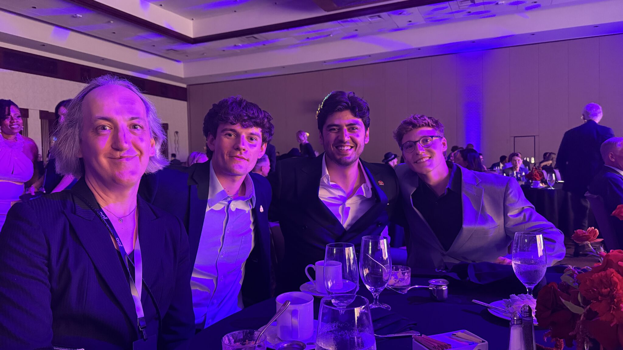
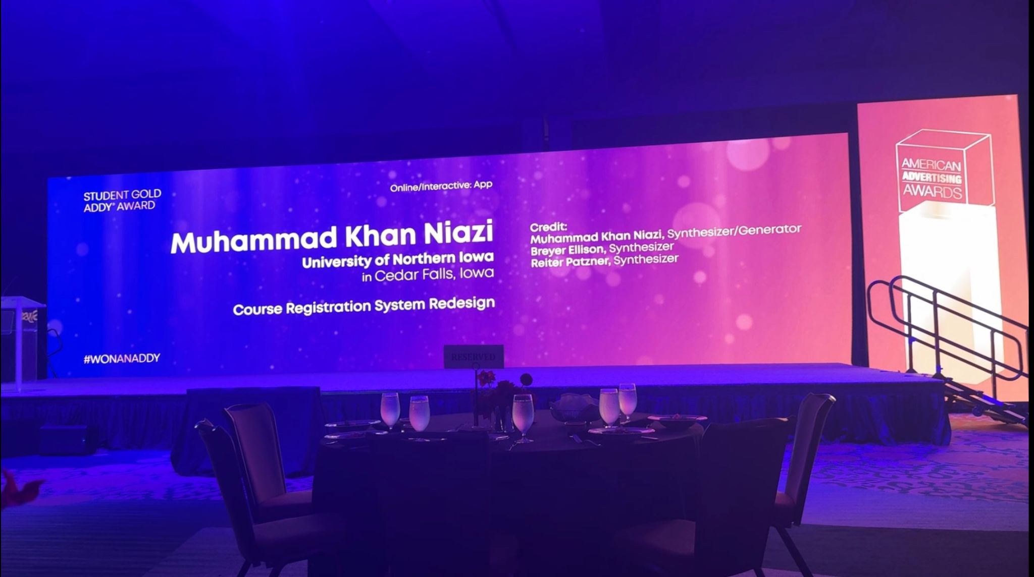
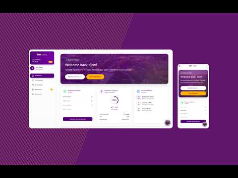
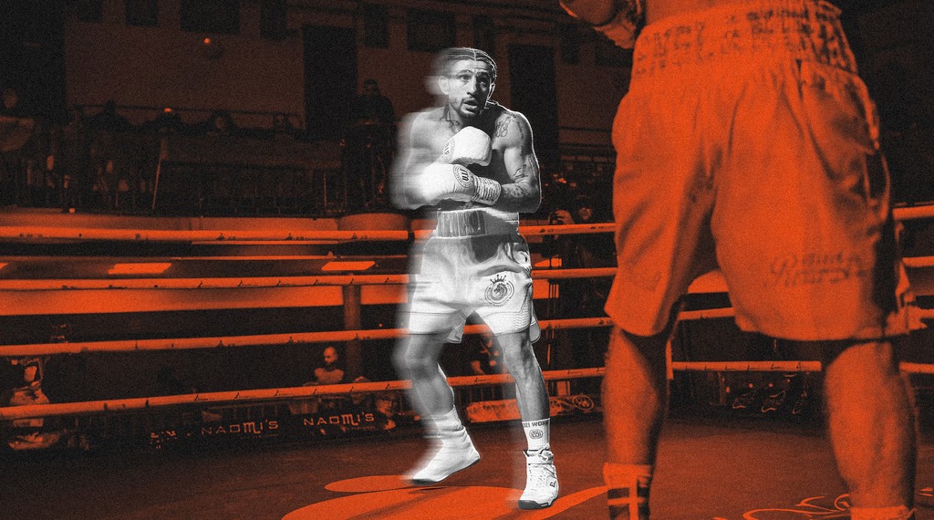
12 interviews. 3 architectures tested. A broken portal rebuilt for 10,000+ students — recognized on a national stage alongside Google, Meta, Ogilvy, and GSD&M.
↑ 40% task completiontime-on-task halved
↗
Self-Initiated · FinTechGLITCH 2025 Runner-Up
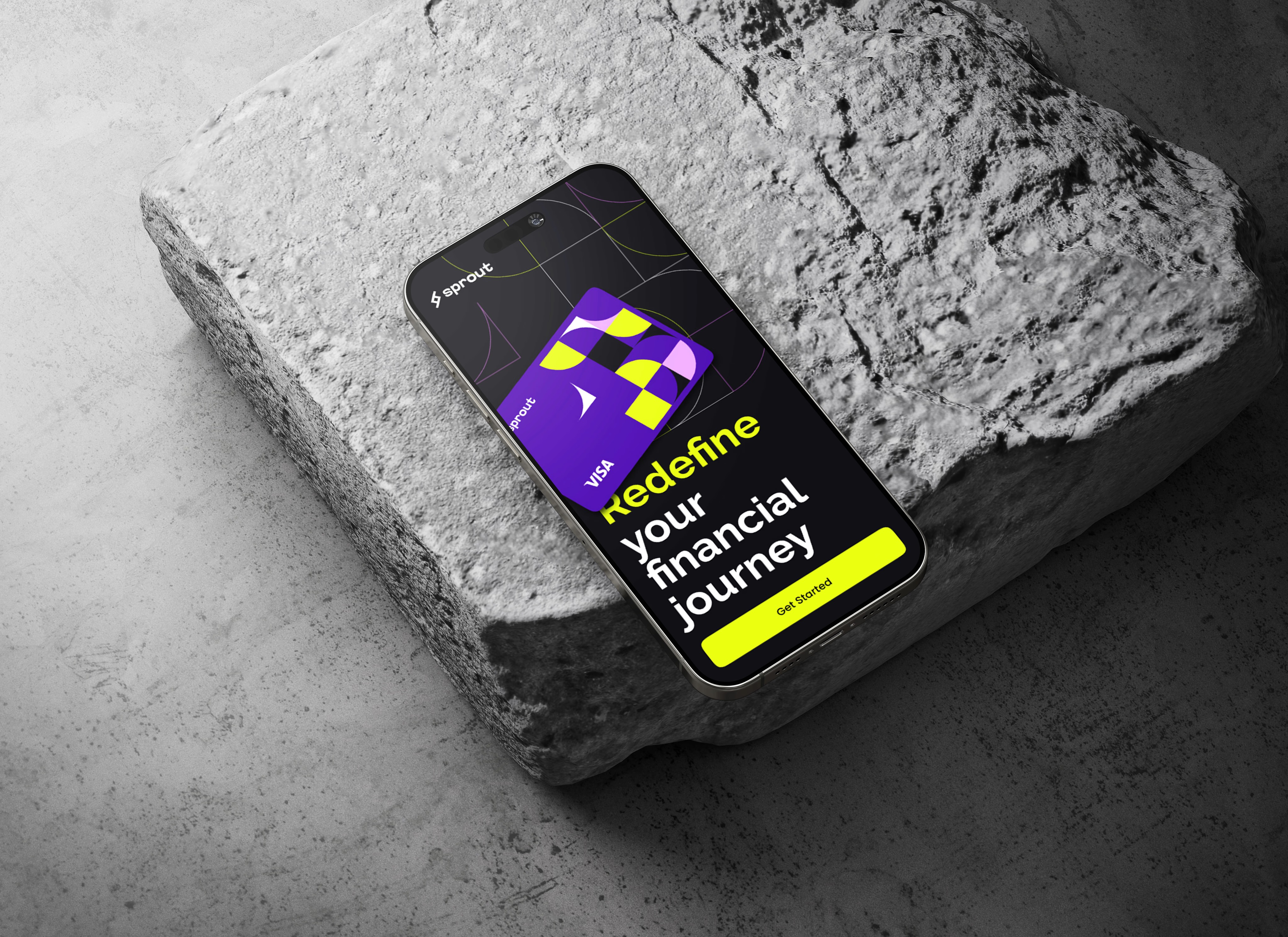
Sprout
A personal finance app built around calm, not data density
Work
UX research, product design, and brand identity,2022–2026.
Lead Digital Designer, editorial design, digital & print
Design systemsEditorial layout
2023
Client Work
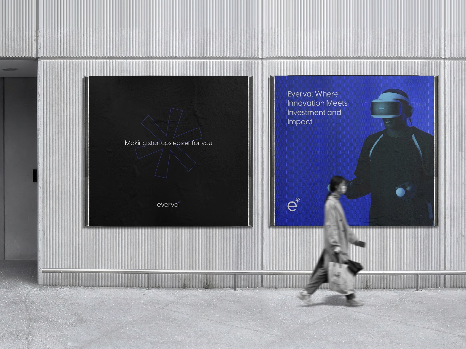
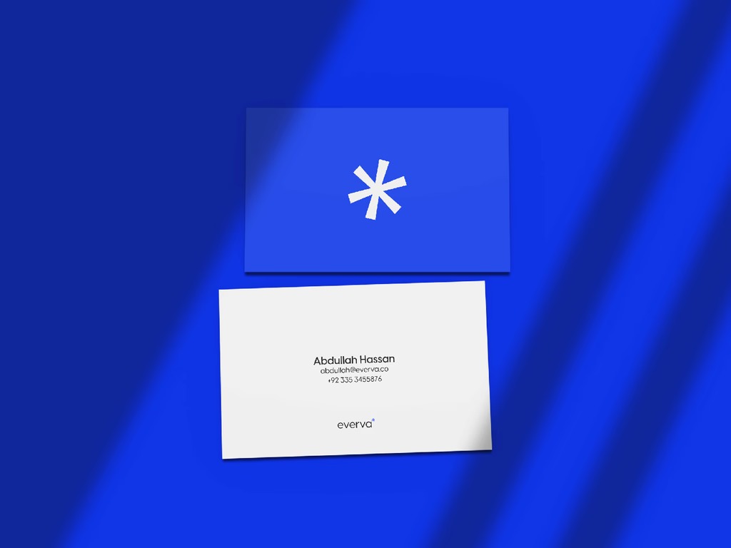
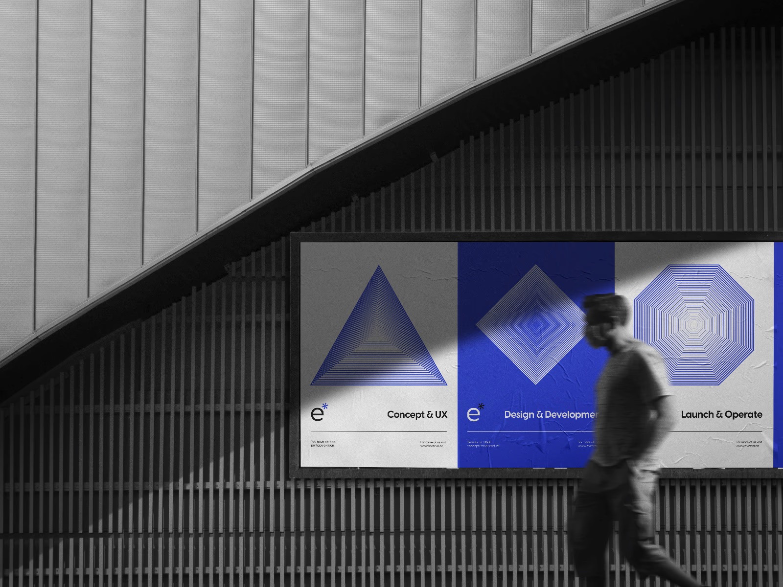
Everva
Full rebrand & web design, software company
Competitive auditBrand strategy
2023
Client Work
Khalai Makhluuq
Visual identity, Pakistani experimental music collective
Brand identityCultural research
2023
Client Work
Solarity
Brand identity, energy & security company
Competitive auditBrand positioning
2023
About
I'm Muhammad K. Niazi, a UX researcher and designer. I recently graduated from the University of Northern Iowa with a BFA in Graphic Design. My work starts from a simple premise: before you can fix a system, you have to understand why it's failing the people inside it.
Over the last three years I've run structured interviews, mapped institutional failure modes, rebuilt registration systems, and designed brand identities from scratch. The thread across all of it is the same: earn the right to a recommendation through evidence, not assumption.
Based in the DMV area. Seeking Product Design, UX/UI, and Visual Design roles.
Research Orientation
I'm drawn to the moments where designed systems and human behavior diverge, specifically the institutional systems people have no choice but to use. Registration portals, healthcare interfaces, civic tools. The failure is rarely the interface itself. It's usually a mismatch between what the system was built to do and what people actually need to accomplish inside it. That gap is where the research lives.
"Niazi is a talented and ambitious designer who I taught in a class on Digital Customer Experience. His real-world experience in UX and interest in exploring AI tools made him one of the most impressive students in the class. His ability to work seamlessly with business students marked him as the rare creative with cross-disciplinary abilities. He took every assignment an extra step — his curious and expansive mind took the group's final project to new heights, winning a Gold ADDY and Best in Show at the local American Advertising Awards. Any organization lucky enough to employ him will quickly see the value he brings."
MW
Matthew Wilson
Associate Professor of Practice, Marketing & Entrepreneurship · University of Northern Iowa
"I've worked extensively with Niazi on multiple projects. He's a talented, young graphic designer who is greatly interested in advancing his craft. That he moved his life half-way around the world to join a leading design school is testament to that. Niazi's enthusiasm is great fuel for his creativity, but is also a source of collaborative spirit. He asks good questions then balances research with imagination — producing distinct designs in the first round and getting everyone to a preferred creative solution quicker. Niazi has the makings of a great career ahead of him."
GN
George Noon
Former Fortune 300 CCO · Brand, Marketing & Crisis Readiness
"I had the pleasure of working with Niazi, who consistently impressed me with his efficiency, creativity, and strategic approach to design. His ability to ask thoughtful questions and clarify project goals showcased a user-centered mindset, ensuring every design met both audience needs and branding objectives. From updating brochures to creating engaging social media graphics, Niazi brought a perfect balance of creativity and strategy to every project."
University of Northern Iowa Official News · "UNI students win Gold national advertising award"
Research Statement
Statement of Research Interest
Opening, The Motivating Question
[ 2–3 sentences on what intellectual problem motivates the application, the animating question, not a career objective. ]
From Practice to Questions
[ How the CRS project, and the gap it revealed, created the questions a graduate program would help you pursue. Narrative of intellectual development, not a résumé retread. ]
Research Interests
Area 01
[ e.g. Institutional system failure & co-design ]
Area 02
[ e.g. Participatory approaches in constrained contexts ]
Area 03
[ To be defined ]
Methodological Commitments
[ Why these methods, the reasoning, not just the names. ]
Program Fit,[ PROGRAM NAME ]
[ Specific faculty, labs, research initiatives. Template per application. ]
What Graduate Study Would Unlock
[ Forward-looking: what questions are currently out of reach? ]
AcademicUX ResearchInformation Architecture✦ National Gold ADDY 2026↗ insideUNI Press
Course Registration Redesign
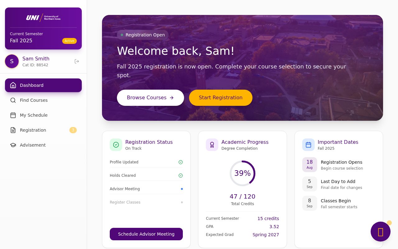
The University of Northern Iowa's registration portal was actively working against the students who used it every semester. I ran the full Goal-Directed Design process: structured interviews, personas, IA testing, and two rounds of formative usability testing, to rebuild what 10,000+ students encounter each semester. Task completion increased 40%. Time-on-task was halved.
Every semester, 10,000+ students at the University of Northern Iowa use the same portal, MyUNIverse, to build schedules, manage waitlists, and track graduation requirements. The system was legacy infrastructure: functional in the sense that data moved through it, broken in every way that mattered to the people inside it.
This project ran through a UX course structured around Alan Cooper's Goal-Directed Design framework, seven sequential assignments moving from raw exploratory research through a tested, high-fidelity prototype. The scope was real. The users were real. The stakes were too: an error in registration can set a student's graduation back an entire semester.
"When students fail to complete registration tasks, is the failure primarily a navigation problem, a feedback problem, or a mental model mismatch, and which of these is most recoverable through design?"
I chose semi-structured interviews over surveys because the problem space was poorly defined going in, I needed flexibility to pursue unexpected threads. Surveys presuppose you already know what's wrong. Twelve participants were recruited for behavioral diversity: the relevant variable was relationship to the registration process, not year in school or major.
Sessions ran 45–60 minutes each. Responses were coded in three passes: open coding, axial grouping, and selective reduction to core failure patterns.
Three Behavioral Archetypes
Saturation hit around interview nine, the same failure patterns surfaced regardless of major, year, or technical confidence.
Persona 01 · Anxious Planner
Sarah, 21 · Junior
Business major. Needs to register for required courses to stay on track for graduation. Creates 8–10 backup options each semester because one enrollment error could set her back an entire semester.
"I literally had to set alarms for the exact time registration opened so I could fight to get a spot in my classes… It definitely caused a panic attack."
Graduation riskSystem unreliableHidden prereqsNo mobile support
Persona 02 · Confused Navigator
Jordan, 19 · First-Year
First-generation student. Struggles with course codes, error messages, and navigation logic, relies on multiple people just to complete enrollment.
"I had to get a lot of help from different people to figure out how to do it. I asked one person, and then had to go to another person for more help."
Confusing errorsNo guidanceNo step-by-step
Persona 03 · Efficient Expert
Alex, 23 · Senior
Communications major. Has mastered every workaround, registers in under 2 minutes. Still frustrated those workarounds are necessary at all.
"I put every class I need into my shopping cart, set my schedule, and when it's my registration time, I just click the checkboxes and enroll. Usually done in seconds."
Back button breaksSession timeoutsNo multi-tab
User Journey Map
Primary persona: Sarah, Junior · Business major · Goal: Register for required courses to stay on track for graduation
SARAH
Scenario: Sarah is a junior year business major who needs to register for required courses. She wants to graduate on time without having to deal with technical difficulties or closed classes.
Primary Goal
Successfully register for required courses to stay on track for timely graduation
Expectations
System that works reliably
Easy course search and selection
Clear schedule visualization
Mobile-friendly interface
Plan
Prepare
Register
Verify
Goals
Create an academic roadmap with support guidance and professor research
Build a course selection and add them to shopping cart
Successfully enroll in courses despite system failures and technical obstacles
Confirm accurate enrollment and obtain usable schedule
Happy
Neutral
Unhappy
"I need to make sure I'm taking the right classes to graduate on time, I wonder if I can get the classes I need."
• Meet with advisor & other support • Check Advisement Report • Research professors
👀
"Shopping cart? What am I buying?"
• Add courses to cart • Plan backup options
👎
"Ugh, why is this so difficult?! Why do I have to repeat the process?"
• Attempt enrollment • Deal with errors
👎
"Well, I guess that was all worth it but Did everything actually go through?"
Saturation hit around interview nine. The same four failure patterns appeared regardless of major, class year, or technical comfort.
Finding 01
Navigation matched no one's mental model
Students think in tasks: "add Biology 201." The system requires Enrollment → Schedule Builder → Add/Drop → Search by Department. Nobody pre-maps that structure, they discover it by getting lost.
Finding 02
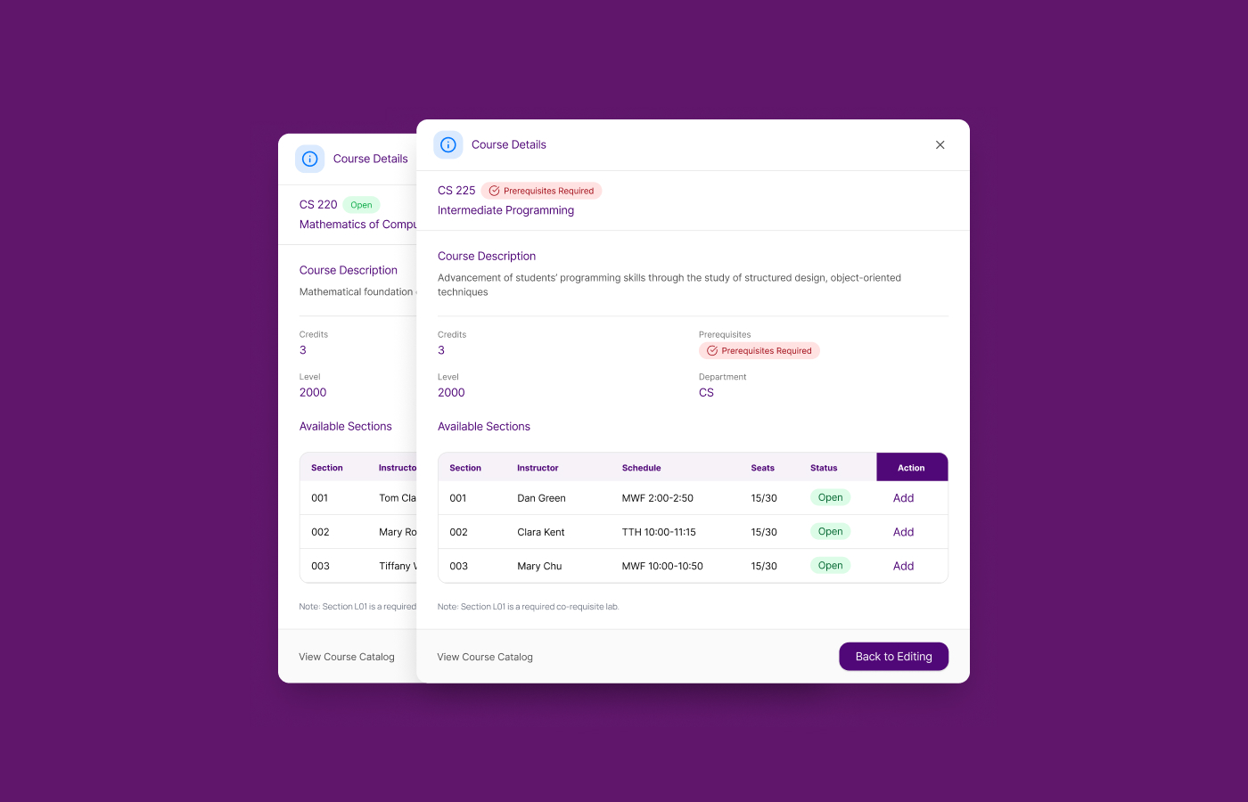
Prerequisites invisible until final submission
Students advanced through multiple screens before hitting a prerequisite block at final submission, no explanation, no path forward. The system moved the wall to the end of the hallway.
Finding 03
Missing feedback created phantom actions
After submitting, the system returned to the original screen with no confirmation state. Students re-submitted, creating duplicates they had to resolve in person, sometimes weeks later.
Finding 04
High stakes treated as neutral administration
Login failures required 5+ attempts. Mobile was unusable. The system treated course selection like a routine admin chore. Students experiencing errors risked graduation delays of an entire semester.
"I just screenshot everything and keep it in a folder. That way I have proof of what I did."
Senior, Computer Science · on working around the absent confirmation states
Design: Three Architectures
Before committing to wireframes, I sketch-tested three navigation structures with six participants from the original cohort. Each addressed the core failure patterns differently.
Option A
Refined hierarchy
Cleaner labels on the existing structure. Slowest completion in testing. The mental model mismatch survived because the underlying architecture didn't change.
Option B
Dashboard-based overview
Status cards per task. Users liked the visual scan. Secondary functions were hard to locate, missing surface area for complex workflows.
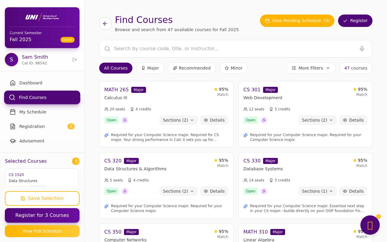
Option C: Selected ✦
Search-first, task-flat
Search as primary entry point. Every action within two steps. Fastest completion, least backtracking, highest confidence. Prerequisites surfaced inline, not at submission.
Testing
Two rounds of formative usability testing, six participants each, drawn from the original interview cohort. Think-aloud protocol on the hi-fidelity Figma prototype. Each round targeted a specific failure pattern identified in research.
Round 1: After wireframes
Navigation learnability
Participants found the search-first model immediately intuitive. Primary blocker: prerequisite information was buried inside a modal rather than surfaced inline. Fixed before Round 2. All six completed the primary task without assistance.
Round 2: Hi-fidelity prototype
End-to-end enrollment flow
5 of 6 participants completed full enrollment without prompting. Average completion time dropped to 1m 48s versus the legacy system's 4m 20s. Error recovery improved from 38% to 91%, participants read and acted on error messages instead of abandoning.
Results
—
Task completion rate vs. legacy system on matched task sets
½
Mean time-on-task vs. baseline across all tested scenarios
✦
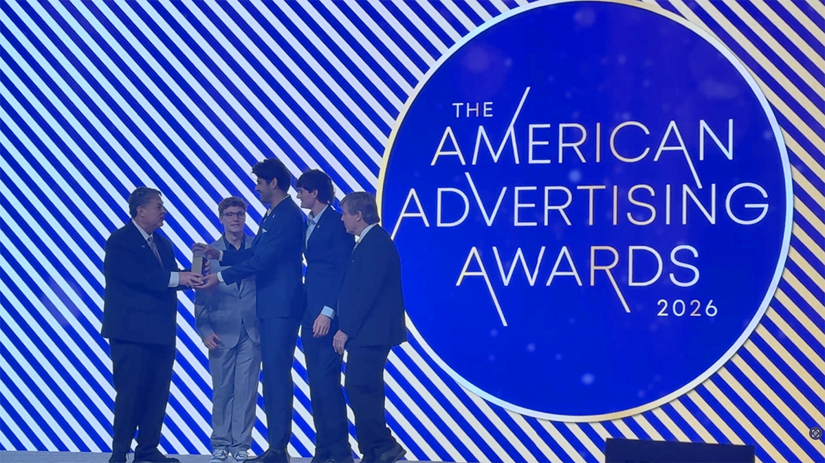
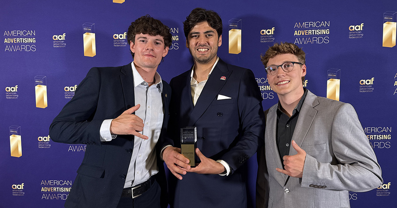
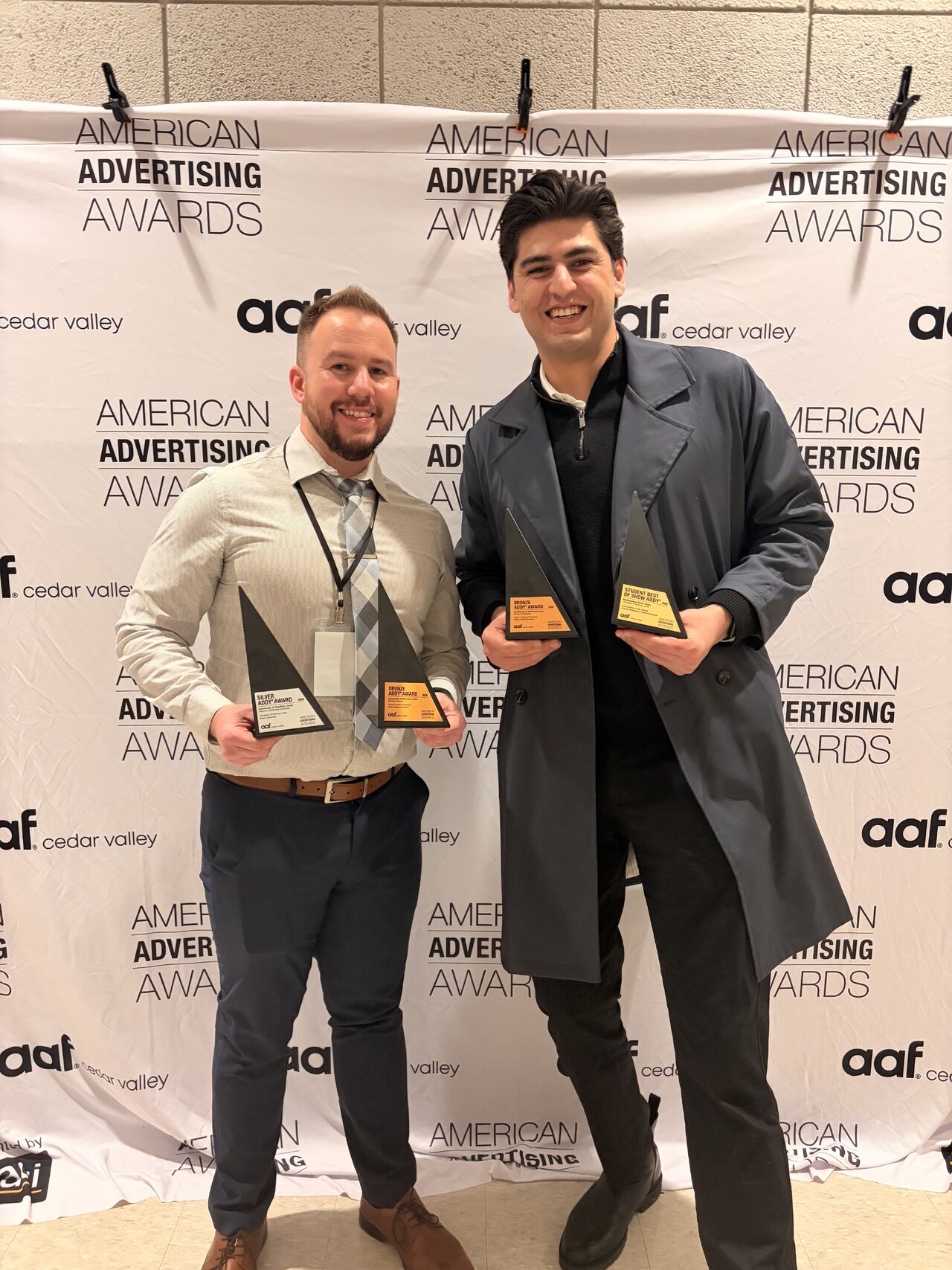
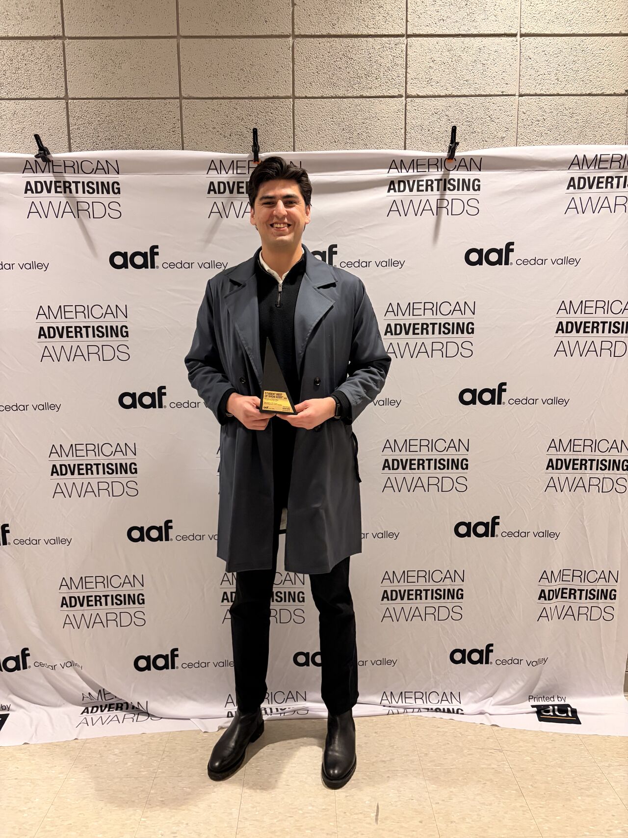
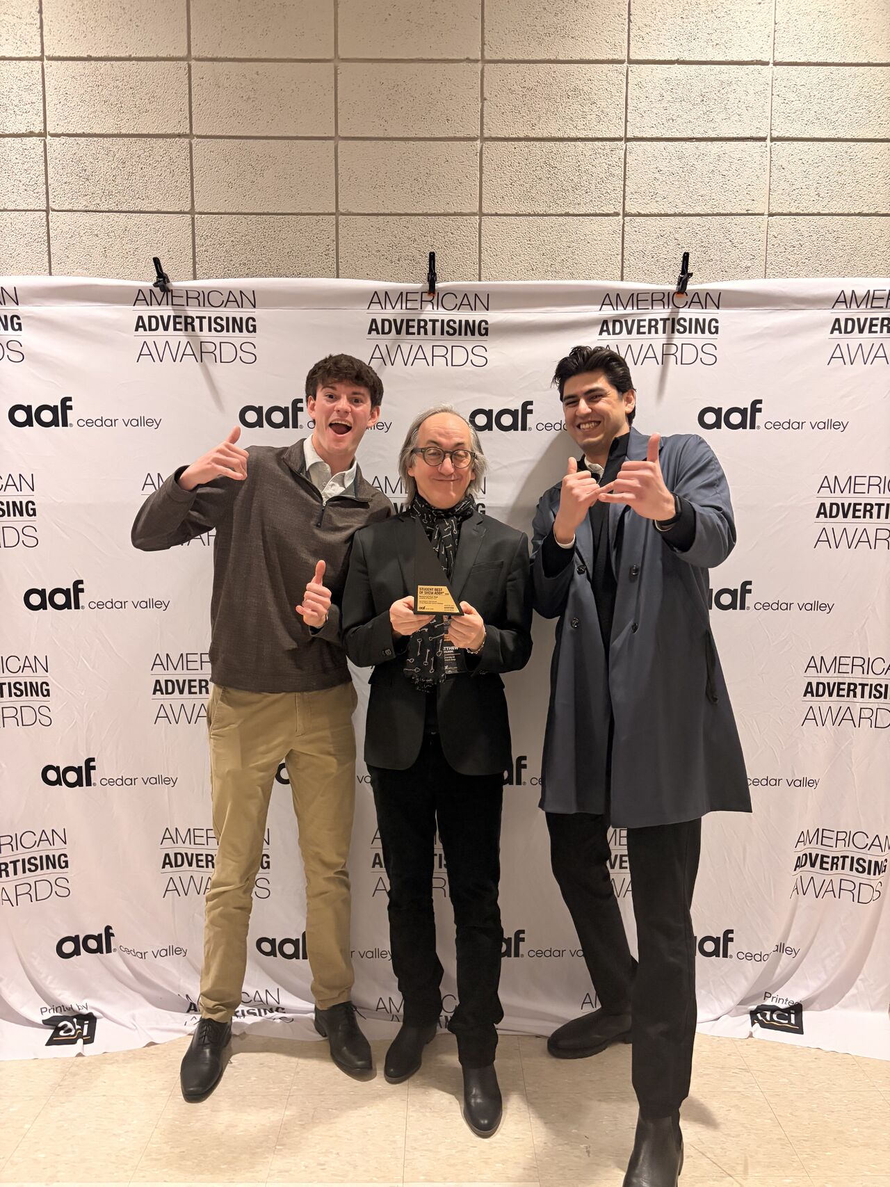
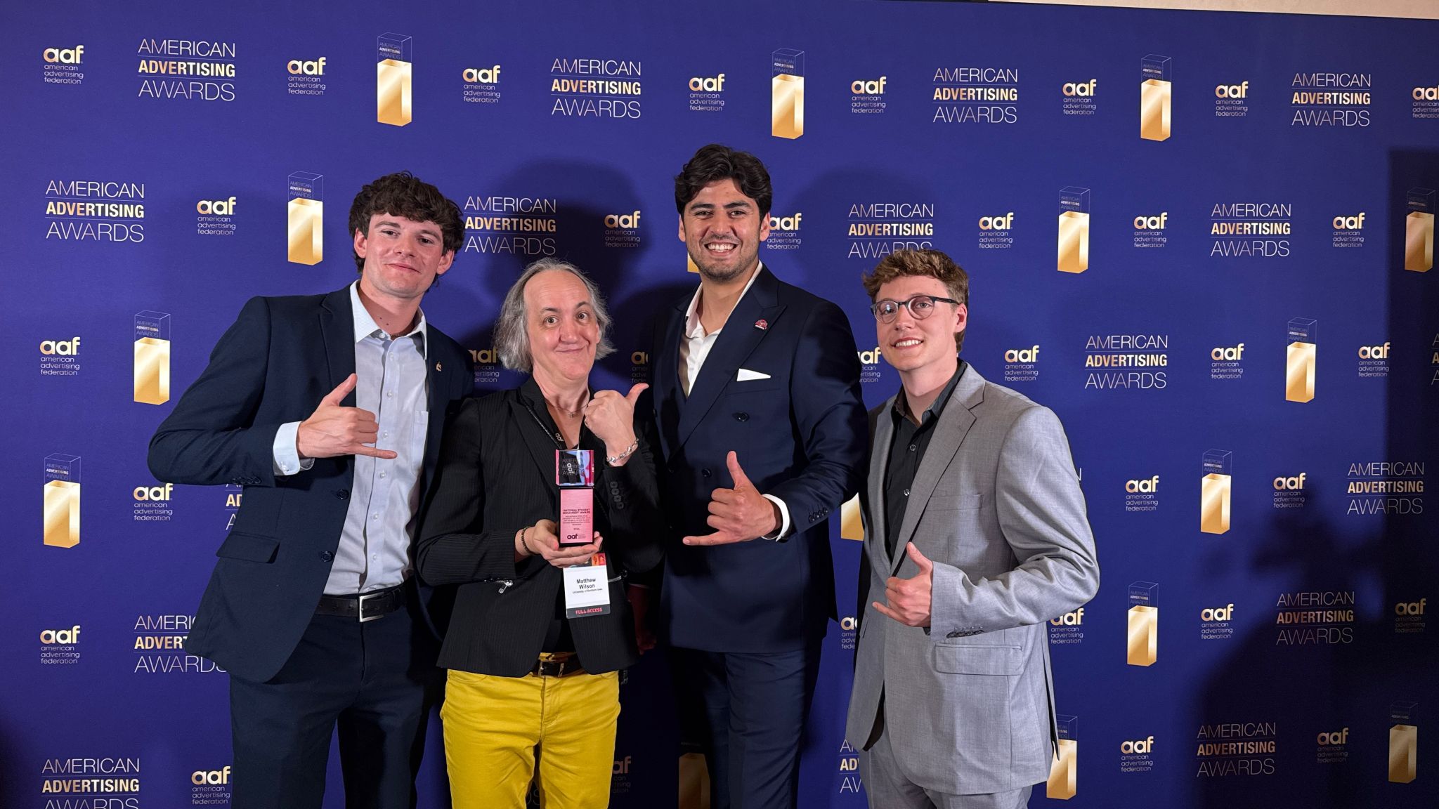
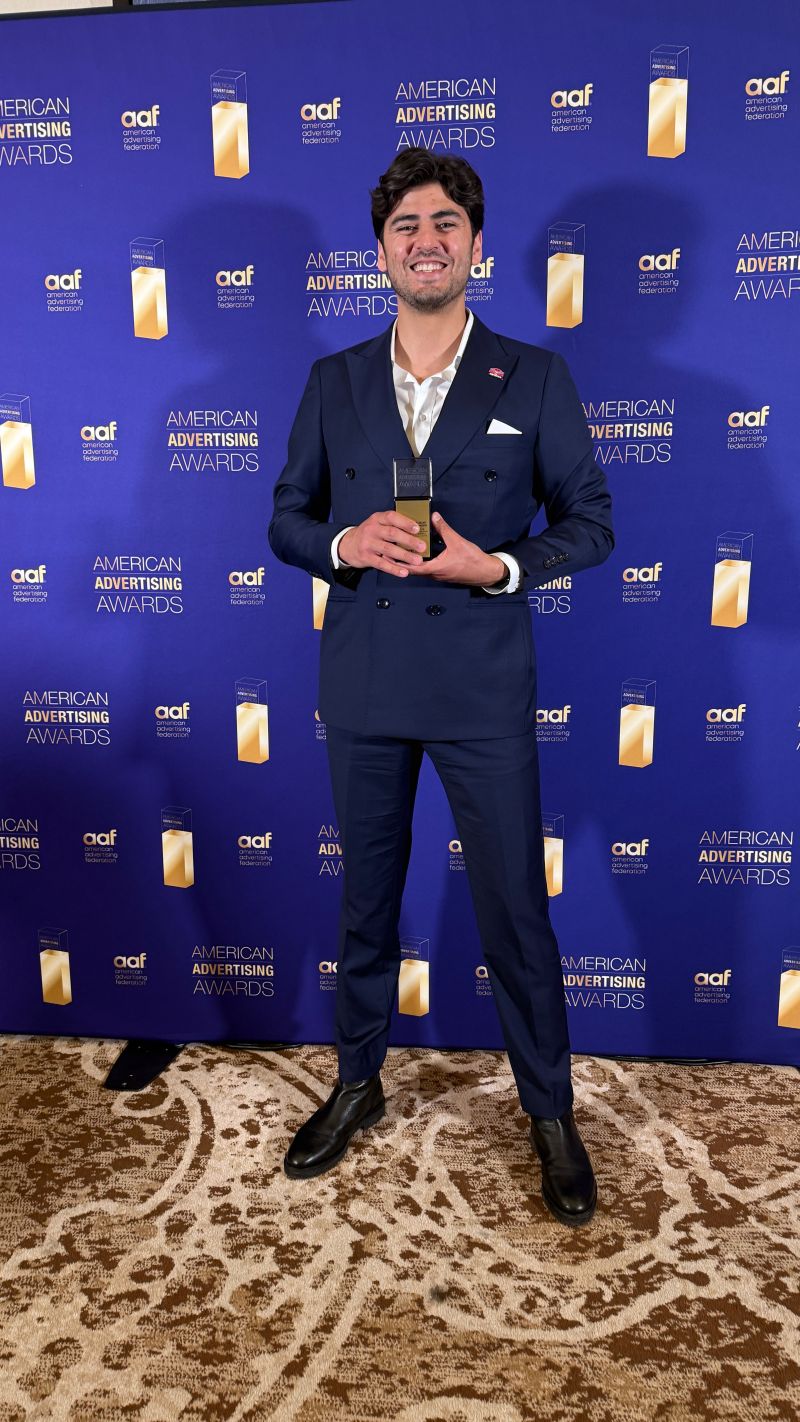
National Gold ADDY 2026 · 1st place out of 25,000+ entries · Shared stage with Google, Meta, Ogilvy, GSD&M & Genesis Motors
"No one expected that three guys from UNI would be standing on that stage, sharing it with the biggest brands and faces in the advertising industry. The only real limitations are the ones you set for yourself — if three boys from Iowa can make it to the national stage, then anyone with the right mindset can too."
The project had a hard three-month window. If I were running this research independently, I'd add a diary study, asking students to log the experience in real time across a full registration period rather than recalling it in conversation. The anxiety dimension never surfaced clearly through retrospective interviews. That's a method gap I'd close.
The sample was drawn from a single institution. Findings about navigation failure, absent feedback states, and prerequisite invisibility are likely generalizable. Findings about specific feature expectations are more institution-specific and would require replication before informing other system redesigns.
The ADDY recognition matters, but design awards and user outcomes aren't the same thing. The metric that counts is whether students who genuinely couldn't afford an enrollment error were better served by the redesign. The quantitative data suggests yes. A longitudinal deployment study would confirm it.
Next project
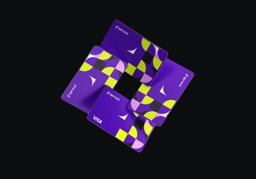
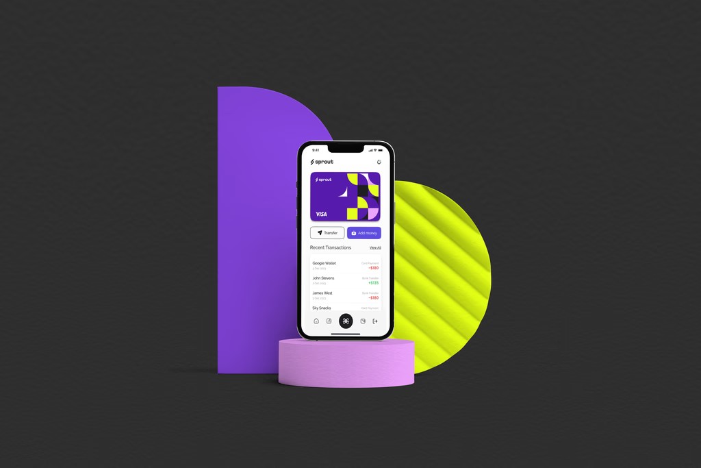
Sprout: Personal Finance App
→
Self-InitiatedFinTechGLITCH 2025 Runner-Up
Sprout
A personal finance app designed to simplify digital transactions, streamline financial tracking, and provide intuitive investment tools, built around calm, not data density.
Role
UX/UI Designer
Industry
FinTech
Duration
1 Month
Recognition
GLITCH 2025: Runner-Up
Year
2024
Context
Sprout began as a passion project, driven by a desire to make managing finances a more accessible, human experience. In today's fast-paced digital world, financial tools often feel overwhelming and impersonal. Dashboards full of charts and alerts competing for attention, leaving users more anxious than informed.
I wanted to create something different: an app that simplifies financial management while empowering users with intelligent tools to make better decisions.
Problem 01
Overwhelming complexity
Most FinTech apps overwhelm users with data density. Every metric competes for attention, leaving users more anxious than informed.
Problem 02
Impersonal tracking
Existing tools treat all users the same, spreadsheet-style tracking that fits power users but alienates everyone else.
Problem 03
No forecasting clarity
Users lacked accessible tools for forward-looking planning. Most apps show you where you've been, not where you're headed.
My Role
I was responsible for every aspect of Sprout's design, from branding to user flows to the full interface. My approach was rooted in understanding user behavior and creating solutions tailored to their needs.
Identity Design
Brand built on clarity
Created Sprout's branding to reflect its mission of simplicity. Logo, color palette, and typography designed to evoke trust, clarity, and accessibility.
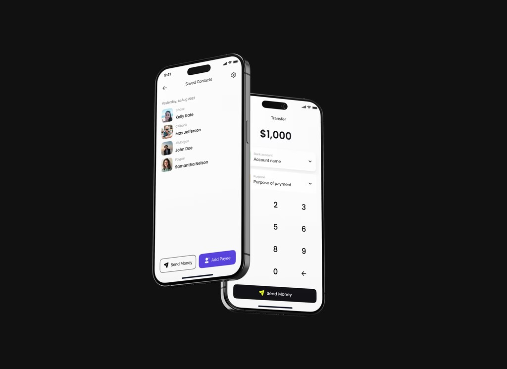
User Flows
Friction-minimal paths
Every flow mapped to minimize friction and maximize efficiency. Users should accomplish tasks without needing to think about the app itself.
Interface Design
Calm visual hierarchy
UI designed for clarity, intuitive layouts and thoughtful visual hierarchy guide users naturally, surfacing one thing at a time rather than everything at once.
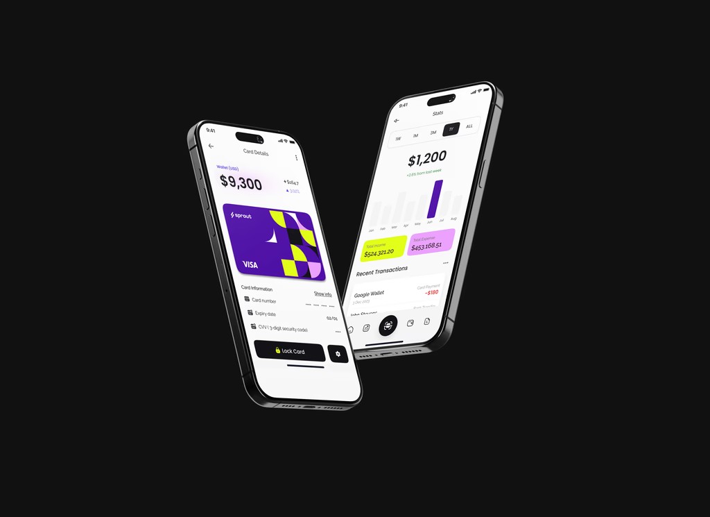
The Design
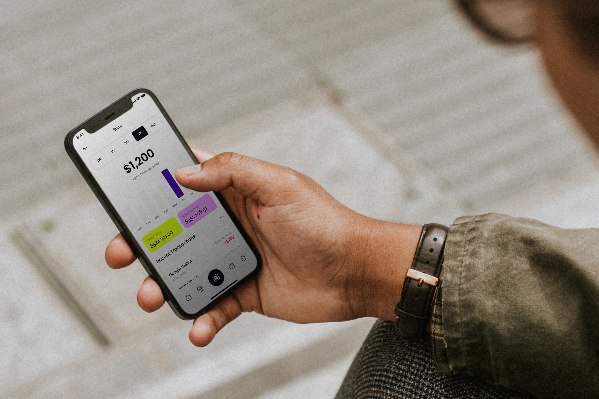
The app offers real-time investment tracking, an AI-powered calculator for predicting financial outcomes, and a clean interface that makes every interaction feel intentional.
The core design decision was restraint: Sprout surfaces one thing at a time rather than overwhelming users with simultaneous data points. The calm palette and generous whitespace are functional choices, they lower cognitive load at the moments users are most anxious about money.
"The goal was to design an app where the experience itself communicates that you're in control, not one that proves its value by showing you everything at once."
Design rationale, Sprout
Next project
Loaded Magazine
→
Work ExperienceMedia & PublishingEditorial Design
Loaded Magazine
Lead Digital Designer. Blending digital innovation with timeless print aesthetics, connecting bold creativity to a dynamic audience across both formats.
Role
Lead Digital Designer
Industry
Media & Publishing
Duration
7 months
Year
2023
Context
When I joined Loaded Magazine as their Digital Lead Designer, I stepped into a fast-paced environment that blended the worlds of digital and print media. My role was dynamic, encompassing both creative direction and hands-on design.
I was responsible for shaping the visual identity of the magazine's digital presence while contributing to print design projects. The challenge: maintaining a coherent brand voice across two fundamentally different production environments.
Key Contributions
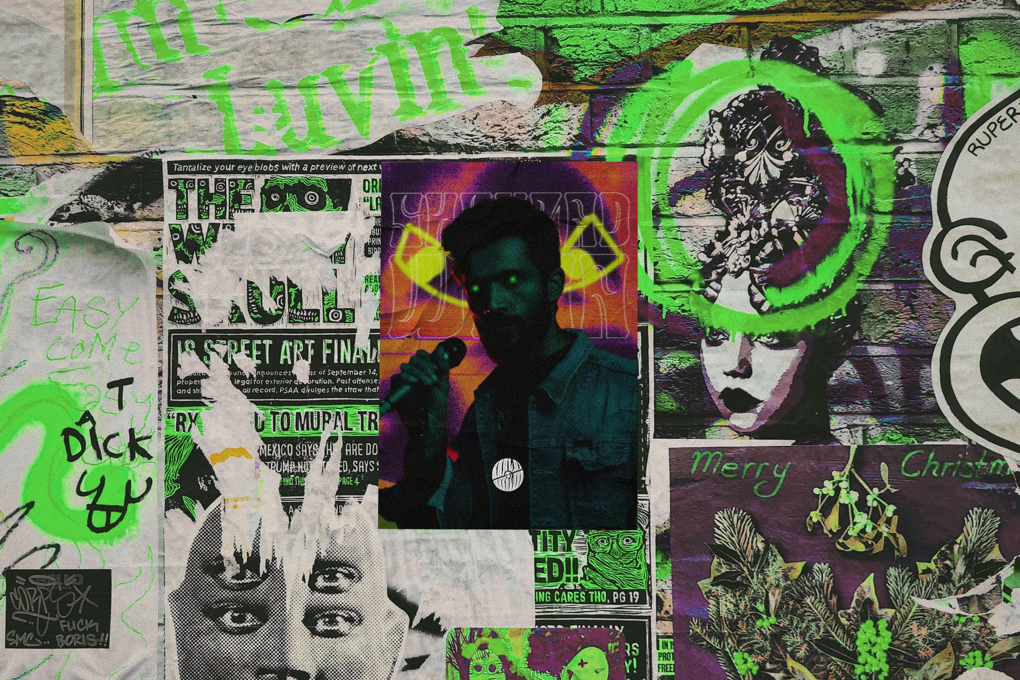
Digital Covers
Visually engaging article covers
Led all digital design efforts, crafting covers for articles published on the magazine's website. Each design balanced boldness with sophistication while connecting Loaded's content to its audience.
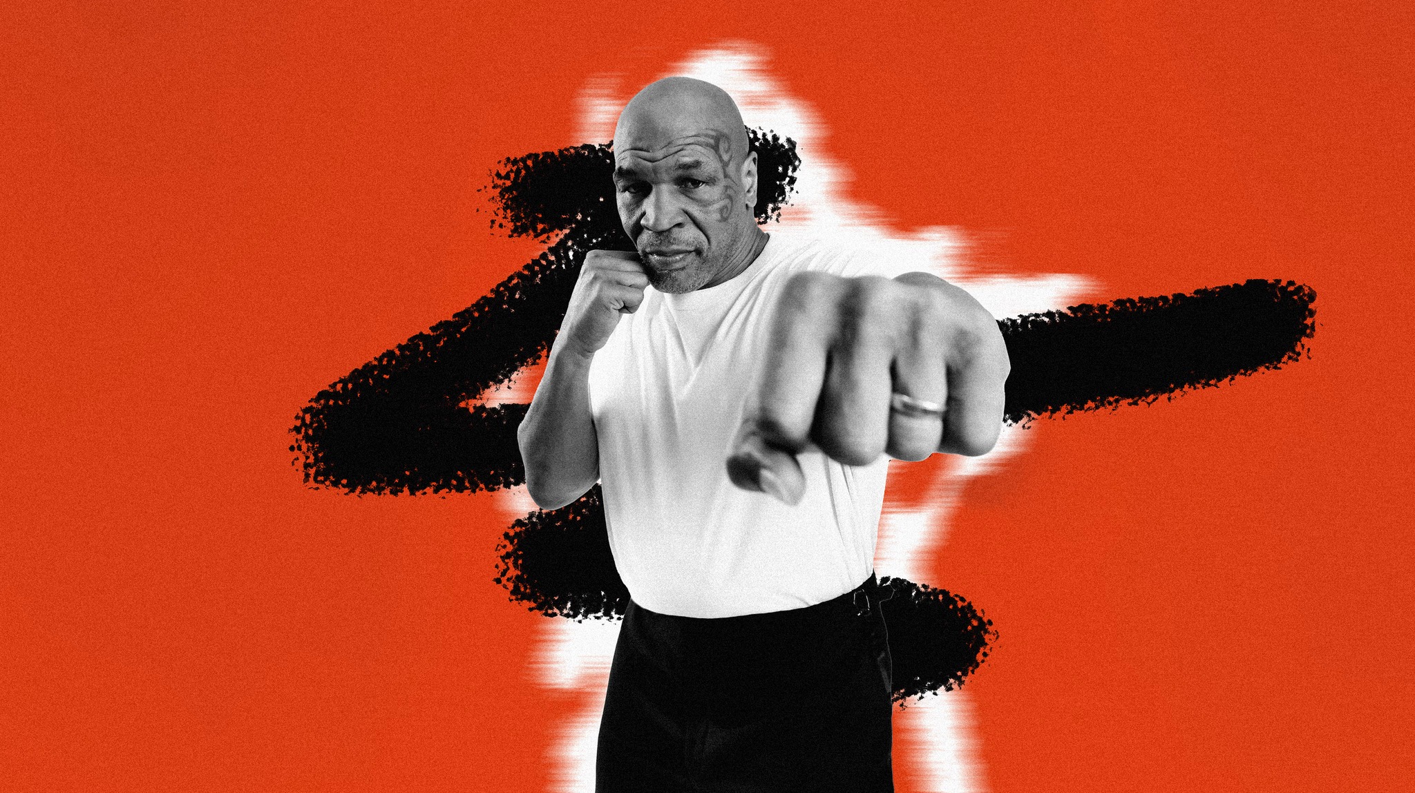
High-Profile Collaborations
Designs for recognizable names
Collaborated with renowned personalities including Mike Tyson and Ric Flair, developing designs that resonated with their individual identities while staying true to the magazine's style.
Cross-Medium Design
Print and digital fluency
Worked across both digital and print formats, strengthening versatility and the ability to adapt visual language to different production constraints.
AI Integration
Modern workflow tools
Integrated AI tools alongside traditional design practices, streamlining workflows and enhancing creative outputs without compromising craft.
Collaboration
I worked closely with Danni Levy, the Editor-in-Chief, whose vision drove the magazine's content. Max H., overseeing design operations, provided strategic guidance that ensured every creative piece aligned with Loaded's evolving brand identity.
This synergy allowed me to deliver designs that stood out while maintaining editorial coherence, the constant negotiation between creative expression and brand consistency that defines good editorial design.
Next project
Everva
→
Client WorkBrand IdentityWeb Design
Everva
Transforming Everva's digital presence during a pivotal business model transition, from investor-focused to mass-audience, with a rebrand and site redesign built to hold both ambitions.
Role
Brand / Web Designer
Industry
Tech & Innovation
Duration
2 months
Year
2023
Context
Everva approached us during a pivotal business model transition, shifting focus from investor-driven projects to a mass audience. This required a thorough repositioning strategy to align their brand identity with their new direction.
The challenge was navigating a brand that needed to feel credible to a new audience, while honoring the innovation and reliability that had defined Everva's earlier work.
Challenge 01
Identity mismatch
Their existing brand identity and website were tailored to investor-driven projects and did not resonate with a broader demographic.
Challenge 02
No connecting narrative
The website needed to be intuitive and emotionally engaging while aligning with an innovative, client-focused ethos, a difficult balance to strike from scratch.
Solution
Brand Repositioning
Identity grounded in values
In-depth research to understand Everva's values, offerings, and audience expectations. Brand identity redefined to emphasize reliability and resonate with a broader audience.
User-Centric Website
Clean navigation, clear story
Prioritized intuitive layouts and visually appealing design to guide users through Everva's offerings. Content strategy refined to communicate expertise in a relatable way.
Audience Connection
Emotional resonance
Stylescapes and dynamic content used to create emotional connection with visitors. Tailored communication channels encouraged interaction and fostered trust.
Business Transition
Built for growth
Website optimized to support Everva's transition to a mass audience, design and functionality aligned with updated business goals to provide a foundation for sustainable growth.
Next project
Khalai Makhluuq
→
Client WorkBrand IdentityMusic
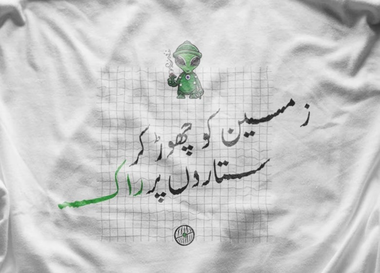
Khalai Makhluuq
Reimagining the visual identity of a Pakistani experimental rock band, capturing the emotions behind their sound while creating a cohesive brand true to their experimental roots.
Role
Brand Designer
Industry
Music
Duration
2 weeks
Year
2023
Context
Khalai Makhluuq, meaning "Aliens", is a small-town rock band based in Lahore. While their primary genre is rock, they experiment across genres and emotional undertones, creating a unique and dynamic sound. This musical diversity inspired me to reimagine their visual identity.
I always believed their design could do more than simply indicate the rock genre. It needed to reflect the emotions and essence of their music, an aura of peace, hope, and desire, infused with the rebellious edge of rock.
Goal 01
Mirror musical diversity
Create an identity that reflects the band's diverse influences, without relying solely on traditional "rock" aesthetics.
Goal 02
Visuals full of character
Design visuals that integrate the band's aura of peace, hope, and desire while balancing rugged and soft techniques.
Goal 03
Cohesive identity system
Develop a cohesive brand where all elements work harmoniously, no single piece overwhelming the overall design.
Approach
The process involved exploring rugged textures and soft gradients, carefully balancing expressive elements to avoid overwhelming the identity. My goal was to create a logo that was expressive yet restrained, a centerpiece that integrated seamlessly with other elements to form a unified whole.
Solution 01
Eclectic Harmony
Combining vibrant colors, experimental patterns, and rock-inspired elements, a dynamic blend of emotions and genres unified into a single harmonious identity.
Solution 02
Balanced Elegance
Balancing rugged and refined design techniques to reflect the band's spirit while maintaining sophistication, character without losing cohesion.
Solution 03
Expressive Simplicity
A clean and timeless logo using minimalistic principles to evoke peace, hope, and desire, with a subtle nod to their rock roots that doesn't overwhelm the whole.
Next project
Solarity
→
Client WorkBrand IdentityEnergy & Security
Solarity
Redefining the brand identity of an energy and security solutions company, from audience research to strategic positioning, establishing a distinctive and impactful market presence.
Role
Brand Designer
Industry
Energy & Security
Duration
2 months
Year
2023
Context
Solarity is a pioneering force in sustainable innovation, dedicated to revolutionizing businesses with renewable energy solutions, advanced security systems, and visionary real estate offerings. Guided by values of innovation, integrity, and sustainability, they needed a brand that communicated that confidence visually.
They faced two key challenges: their existing brand lacked the effectiveness to resonate with their audience, and they were struggling to position themselves clearly in a competitive market while considering multiple avenues for growth.
Goal 01
Distinctive brand identity
Establish a new identity to effectively represent Solarity in the competitive energy and security solutions market.
Goal 02
Audience psychology
Deepen understanding of the target audience, focusing on tone, voice, and positioning to align communication with their needs.
Goal 03
Strategic diversification
Identify and pursue diversification opportunities to enhance Solarity's offerings and create a more impactful market presence.
Solution
Brand Reinvention
Identity rebuilt from the ground up
Redefined core values, visual elements, and messaging, creating a fresh identity that distinguished Solarity as a trusted provider for corporate and institutional clients.
Client-Centric Solutions
Built on audience research
Extensive research into the psychology of the target audience, unraveling tone, voice, and positioning insights that informed solutions resonating with clients' actual needs.
Strategic Expansion
Growth-ready positioning
Strategically evaluated potential growth avenues. By identifying opportunities aligned with their objectives, they addressed immediate challenges while setting the stage for long-term adaptability.